

Design Systems • UI/UX • Responsive Design
ReVolt Motors:
Modular Design System
Executive Summary
Client names and branding have been changed to protect confidentiality.
I architected a high-fidelity, responsive design system for an EV dealership concept to bridge the gap between antiquated automotive UX and modern consumer expectations. By transitioning from fragmented layouts to an atomic component library in Figma,
I created a scalable framework that streamlines the car-buying funnel and reduces future design debt by ~40%.
The Challenge
Solving the Friction in Automotive UX
In the EV market, the digital storefront is the first point of contact. When the online experience lacks the polish of the physical vehicle, buyer confidence erodes. I identified that fragmented layouts and poor mobile performance on the homepage often cause users to bounce before they ever reach the inventory.
The Constraints
Due to NDA restrictions from previous automotive work, I needed to build a brand-new identity from scratch while applying real-world industry knowledge. This project was not just about aesthetics. It was about solving three core friction points:
Cognitive Overload: A lack of visual hierarchy made high-value actions, such as financing and trade-ins, difficult for users to find.
Design Inconsistency: Non-standardized patterns across pages created a fragmented brand feel that hurt credibility.
Mobile Gaps: Navigation and click-to-call behaviors, which are critical for on-the-lot buyers, were often treated as an afterthought.
The Objective
Create a zero-debt design system in Figma that allows a dealership to scale their homepage and responsive landing pages without losing brand integrity or mobile usability.


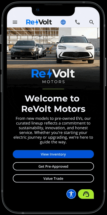
The "Happy Path" Responsive Prototype
I delivered three distinct high-fidelity prototypes for desktop, tablet, and mobile. These demonstrate the intended responsive behavior for the homepage, including:
Mobile-First Navigation: A sticky header with touch-friendly submenus designed for one-handed use on the dealership lot.
Reduced Cognitive Load: A simplified content hierarchy that prioritizes trade-ins, financing, and inventory based on real-world conversion data.
Interactive Utility: Persistent access to chat and accessibility tools, along with accordion navigation in the footer to reduce scroll depth on small screens.
The Solution
Building a Modular Framework for the Modern EV Digital Storefront
To solve for scalability and friction, I moved away from static page design and toward a modular, component-based architecture. This approach ensures that every interactive element works together to guide the user toward a conversion.
Brand Identity & Scalability
Before any UI work began, I established a single source of truth for the brand. This included a type scale, a spacing system, and a color palette featuring blue tones for trust and green accents for eco-appeal. I tested every color combination for WCAG AA accessibility compliance to ensure the brand remains inclusive and professional for all buyers.
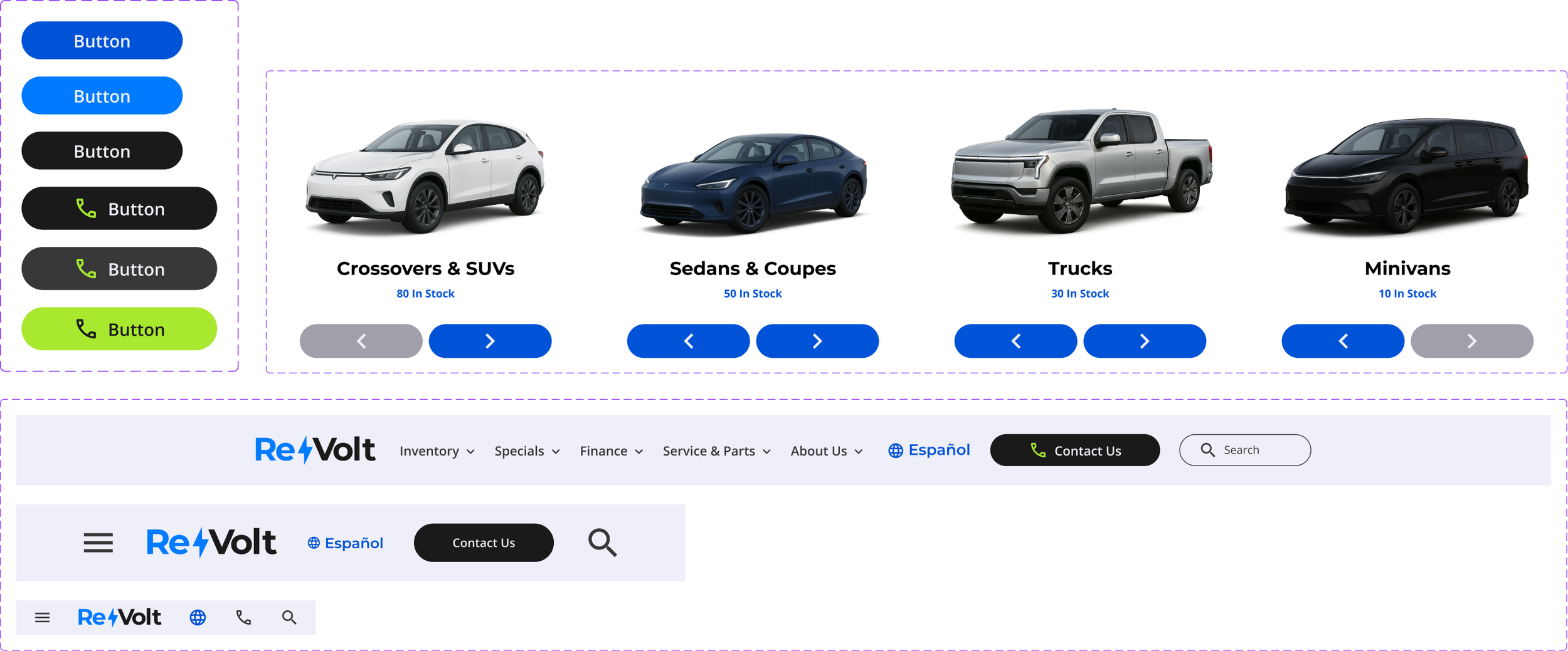
The Atomic Component Library
Using atomic design principles in Figma, I built a library of reusable assets designed for rapid deployment. By using Auto Layout throughout the library, any future page can be assembled from existing components, which drastically cuts down on design debt and production time. Key components include:
Global Navigation: Responsive search bars and multi-level dropdown menus optimized for touch and click.
High-Intent Modals: Standardized contact and lead-capture modals to maintain brand consistency across the funnel.
Dynamic Scrollers: Custom model image carousels and testimonial scrollers designed to showcase inventory without overwhelming the viewport.
Interactive Atoms: A centralized library of buttons and iconography used across all breakpoints.
Prototypes: Desktop • Tablet • Mobile
Component Library: Open in Figma

The Building Blocks
Before a single pixel of the homepage was placed, I developed a modular framework designed for scale. By defining the core visual rules and structural grids first, I ensured that every component would function as part of a unified ecosystem.
Style Guide
Defined core brand elements including a logo, color palette, type scale, spacing system, and icon set to establish a cohesive visual language that anchors the design system.

View the full style guide in the Figma file.
Site Map
Created in FigJam to map out the core content structure based on user needs and dealership goals.

Grid System
Established a 12-column responsive grid to maintain structural integrity across breakpoints and simplify layout decisions.

Components
Built using atomic design principles and Figma’s Auto Layout. These components ensured consistency and adaptability across all templates.
The Result
A Scalable, Zero-Debt Foundation
The project delivered a fully realized, responsive homepage prototype supported by a robust design system. By transitioning to an atomic framework, I eliminated the need for one-off layouts, projecting a ~40% gain in production efficiency. This shift ensures that any future expansion, from new vehicle detail pages to service scheduling, can be deployed using existing components rather than starting from scratch.
Key Outcomes
System-Ready Prototype: Delivered a three-breakpoint prototype (desktop, tablet, and mobile) featuring consistent and scalable UI patterns.
Reusable Asset Library: Built a documented, Auto Layout enabled pattern library in Figma. This atomic approach allows for any future page to be assembled from existing components, directly cutting future design and development time.
Industry Alignment: Strengthened hands-on expertise in responsive design systems, accessibility compliance, and design-to-spec documentation tailored for high-compliance industries.
Reflection & Next Steps
Building this system from the ground up reinforced that a design system is only as effective as its documentation. In a real-world environment, the next phase would involve A/B testing the Trade-In and Financing CTAs to further optimize the conversion funnel based on user behavior. This project successfully demonstrates that high-utility industries like automotive do not have to sacrifice modern UX for functional complexity.